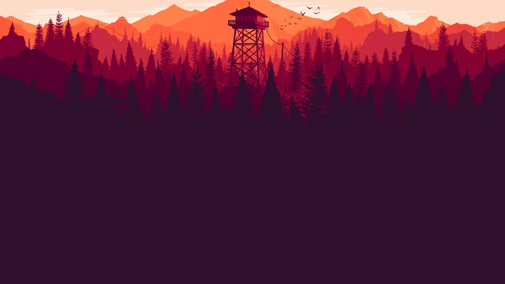
A lot happens in the spaces around us that can reveal the narrative. These incidents give the character clues to solve a mystery or guide them where the story might go next. It’s a fine technique in storytelling where you “show” rather than “tell”. Campo Santo’s single-player adventure game ‘Firewatch’ does a fantastic job of that.
Set in 1989, ‘Firewatch’ follows Henry, who leaves his old life behind to work as a fire lookout in the Wyoming wilderness. His only connection to the outside world is his supervisor, Delilah. She is located on the Thoroughfare Lookout, and never gets to meet Henry in person. The entire story evolves around their conversations on a radio.
During an especially dry summer, Henry has to ensure that the forest stays smoke-free. However, as things begin to unravel, the vast wilderness becomes a breeding ground for mystery.
This is where the beauty of the game is truly revealed.
An adaptive environment
The game leaves a lot to the imagination – except when it comes to the environment. Even as the main character, we don’t know how we look until we come across a few photographs of Henry and his partner. We never meet Delilah, and we only get to know about her life, her emotions and mood through her voice.
The story unfolds almost entirely through the conversations between Henry and Delilah. The few other characters we encounter appear only as distant silhouettes or shadows. But what appears vast and ever present is the wild, hot nature of Wyoming.


The game seems dipped in sunset. And due to its ready reliance on a natural landscape, the setting guides the character in his actions. The details such as a fallen tree, or a steep cliff, or a gorge act as cues for his next step. For example, a series of rocks in front of him compel him to climb up to reach his watch tower. Or a locked gate prompts him to look for ways to break in – either with a rock or search for a tool. Almost nudging him to do something he wouldn’t otherwise think of doing.
But the environment also changes its colours and tones with the game’s changing mood. It quickly gets dark and mystifying when Henry is about to find out something unnatural. And the best part takes off towards the end. When we get to see how the entire landscape around him was preparing to reach this moment all along.
It is a well-planned climax to say the least. And your content design should feel like nothing less. It should become part of your content.
Guide your reader through your content
Every element in your content – the typography, spacing, button placements, CTA banners, the colour palette, and the visuals – act as cues for your reader. And good content design is all about anti anticipating movement. Where will your reader look next? What might they need in that moment? A good layout answers those questions even before they’re asked.
It is also about how much information your reader can take at once. If your page is too crowded, it will not only distract your reader but also annoy them. Enough to make them not want your product anymore.
Let’s look at these two poetry websites that regularly have over 100k+ viewers everyday.
‘Poem Hunter‘s website at a glance tells you everything that could have gone wrong with the design.
Fewer things hurt a writer more than an ill-designed website dedicated to poetry. The horrors of landing on a webpage where a sign up bar, poem of the day, and a list of “hot” poems are thrown at you all at once is inexplicable.

Comparatively, Poetry Foundation does a fairly better job in guiding you through their website. The landing page (normally) shows you the featured posts, a navigation bar with clear categories, and gives you ample time to explore before a banner pops up, urging you to sign up.

Image source: Poetry Foundation.
Everything on your page leads to one final action
Whether it’s to make your reader sign up for your services or get a trial session or just to fill out a form, your content is a pathway to that decision. Everything they read and interact with on that page is intentionally nudging them towards the next step.
For Henry, everything in the landscape guided his choices. From the first smoke he spotted in the forest to the hidden lab he later discovered, every object around him prompted his next move.
Treat your webpage like this vast landscape. You can put anything anywhere, but since you are creating content for value, every element has to have a meaning. Even if it is divider. They all don’t have to make sense as once, but if you are putting that element there it has to make the reader do something. Just like Chekov’s gun, that if you have put a rifle in the room it must be of some use later in the story.
So next time you are adding a button after the second paragraph, try to imagine if you really want your reader to move on right now – or linger a bit longer!